What UXW Taught Me About Advertising
About UX writing, designing with words & how to speak human

Did you know, that across the internet, 80% of users* leave a webpage after just 15 seconds?
Maybe it’s because most copywriting is a waste of time.
Attention is scarce. In mental real estate, every word has to earn its keep.
That’s why UX writing has become the secret weapon of the tech industry — guiding people with language so clear and concise that they barely notice it.
If copywriting tries to be memorable, UX writing aims to be forgettable — in the best way possible.
In this guide, you’ll learn about the similarities and differences, and get 9 ½ tips to improve your own writing, no matter the kind.
*If you’re still here, you belong to the curious and diligent 20%. I like you! Stick around!
UXWhat?
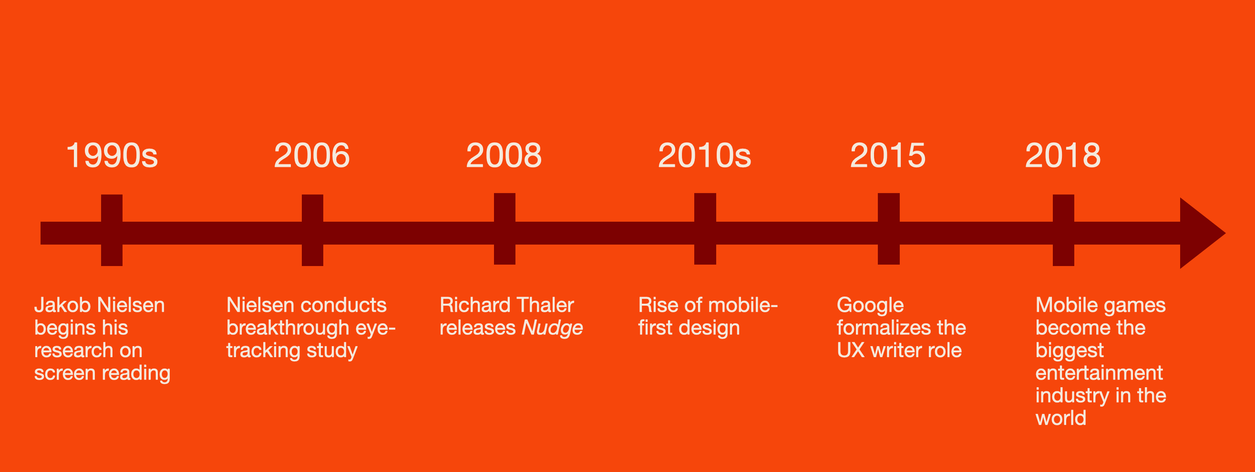
UXW — or User Experience Writing — is still a young discipline, born around 2015 when Google recognized that a new kind of reader needed a new kind of writer.
After two decades of eye-tracking and data collection, it was obvious that people didn’t read on screens like they read in books.
Disheartening as it may sound, most people won’t cling to every word, left to right, all the way down to the conclusion (except for you, dear reader, because you’re smarter than those other people).
On screens, most of us scan.

This quote is from 1963, when the only screens were TVs. Maybe it counts double now?
Already in the 1990s, Danish computer scientist Jakob Nielsen theorized that people not only read slower but differently on screens.
In 2006, he led an eye-tracking study that turned out groundbreaking and concluded that screen reading happens overwhelmingly in F-shapes and Z-shapes.
Along with mobile-first design and nudge theory in the 2010s, this paved the way for dedicated UX writers in tech. UXW soon became the secret superpower of mobile games, and from there it moved into almost all industries, both in the digital space and in product design and packaging.

Did it work? Drop a comment at the end of the essay.
The new insights into reading patterns gave birth to a new, concise style of writing — microcopy — with front-loaded messaging in a clear, direct language. Where the old internet had been written in long-winded tech jargon, getting to the point and speaking human now proved measurably valuable.
These days, you see UXW all the time — signs, messages, in-app onboarding flows — but when it’s really good, you barely notice. It’s so concise and so human that it’s almost like a silent voice leading you where you already wanted to go. It removes all friction on the user journey and makes it feel wordless. The best UXW is invisible.
Copywriters love it when their work is noticed and remembered.
UX writers hope that it isn’t.
UX Writing vs. Copywriting
Copywriting is marketing and UXW is design. Well, usually.
Writers who only do one thing or the other will tell you how immensely different they are.
But both serve as extensions of the brand voice and have more in common than you might think.
How they’re different
Copywriting can be provocative or poetic because it’s trying to lure you in. It’s persuasion concealed with creativity, a flirtatious dance with the reader. Copywriting is equal parts salesmanship and seduction.
UXW is there to give perspective, direct action, and get out of the way.
Copywriting is like dating, and UXW is after you’re married. If the marketing made seductive promises, UXW has to keep them and keep the marriage going once the honeymoon is over.
Copywriting can use conflict and FOMO. UXW has to remove friction and relieve anxiety.
Copywriting sells, UXW helps.

Microcopy even more so.
How they’re the same
Both copywriting and UXW aim to be concise, easy to read, and less about writing than about applied psychology. Both can rearrange objective information to create subjective value and change the customer's perspective. And both have to sound like they’re coming from the same, healthy, trustworthy organism.
There is usually a difference in tone between a brand’s copywriting and UXW, but the voice should always be the same. A consistent voice makes the brand persona believable and relatable; a fragmented voice can sound like it has Split Personality Disorder.
No one asked you! Whether you’re a copywriter or UX writer, your reader isn’t interested in your prose. They are trying to do something else, and you have to earn their attention. Every. Word. Must. Count.
Copywriting sells, but UXW does most of the upsell. Introducing users to changes they didn’t ask for is always an upsell. So is asking them to download an app or scan a QR code. If nothing else, you’re upselling the total brand experience. Just look at any app with in-app purchases to see how blurry the line between copy, content, and UX writing can get.
Both are assembled rather than written. UX writers work closely with designers to create flowcharts and choice architecture where the order of the information is as important as the info itself. Now, look at Joseph Sugarman’s famous copywriting model from the 1970s below, and tell me if you see a classic narrative structure or a user journey.

9 ½ Lessons From UXW
1. Be helpful to your user. That’s the only thing that matters! Understand their situation and have empathy with your least abled, least informed, least attentive user. Research their journey. Interview endlessly. Beware the curse of knowledge.
2. Be clear. Never fall for industry jargon, always find the human word. It’s not your customers’ job to learn your language — it’s your job to speak theirs. Simplify without dumbing down. If your message can be understood by your dumbest reader without boring the smartest, you can reach all audiences.
3. Be concise. “Short beats good” is a mantra from Google’s UXW division. Don’t try to say too much. Front-load your sentences = put the important stuff first so it’s easier to scan. Attention is a bell curve; too much information is just as bad as too little.
Below you can see how Google puts the first three principles to use.


4. Make it sound easy. If you describe an easy task in a complicated way, it will be perceived as difficult simply because it’s hard to understand. In the example below, “migrate” sounds like a long and possibly troublesome journey, whereas “bring” feels a lot easier.

5. Make changes and updates user-relevant. Always remember your user’s point of view. In the B&O example above, “existing, saved stations” is not only a technical redundancy (existing and saved are the same!), it’s a function-centric way of seeing it. “Favorite” is how the user sees it. If you want to drive action, find your user’s point of view by illustrating the benefit of change or the implied downside of doing nothing. The LinkedIn example below does just that.

6. Remove friction. Don’t assume commitment. Every little mental barrier can make your user leave. Rearrange the order of events, if you have to. The example below is from Google's hotel search feature. Initially, the call-to-action was “Book a room,” but after A/B testing, Google discovered that changing the CTA to "Check availability" led to a 17% increase in user engagement. “Check availability" felt like lower commitment to users and was more aligned with their mindset during the browsing phase.

6 ½. If you want to be remembered, add friction. A 2010 study from Princeton found that a slightly disfluent font (or just cursive) improved recallability after reading by 14%. The theory is that too little cognitive friction will make the user click mindlessly through the flowchart but not remember anything. This goes for structure too. Give the reader something to do, make it interesting… just don’t make it hard.
Examples include the book-ish font you’re reading right now and these 9½ tips instead of straight-forward 10. Inspired by Richard Shotton’s wonderful guide to applied behavioral science, The Illusion of Choice: 16 ½ psychological biases that influence what we buy.
7. Give bad news a silver lining. Adaptive Preference Formation is the psychological bias that makes us adjust our opinions based on available options. Without a silver lining, we default to negatives. So, if you must deliver bad news, help your user see the upside. A study from the University of Texas found that people prefer “sold out” over “out of stock” because “sold out” reminds them of fellow humans making the same choice as them; it’s basic social proof. “Out of stock” reminds them of an empty warehouse where someone with a forklift forgot to stock the shelves. Amazon’s self-service stores found the perfect way to frame this, as pictured below.

8. If you have nothing to say, make it interesting. Sometimes you’re forced to fill out a space with words, so why not make it a good read? If you have an opportunity to create psychological value, use it. Packaging copy and patch notes have become popular spaces for brands to get creative, as seen in these examples from Oatly and Slack.

Even the boring side is interesting.

If you have nothing to say, you can still help your user. This wholesome update even went viral.
9. Perspective is everything and context is a superpower, as Rory Sutherland (former copywriter and current vice-chairman at Ogilvy) puts it. The nature of our attention shapes the perception of our reality. That’s why a small shift in perspective can change an experience fundamentally. If you apply these 9½ principles, you can help your audience experience new sides of your product and maybe even life.

The orange circles are the same size but perspective is everything.
Conclusion
In a way, UXW is the purest kind of commercial writing because copywriting sometimes forgets its larger purpose and basic human function in pursuit of conversion and metrics.
But it shouldn’t.
If you’re talking to one, you’re talking to millions.
In an era where brands live in glass houses, everything is above the line, and every word becomes an advertisement for the brand — but only if it serves the user.
If you steal 10 seconds of someone’s time, give them value and meaning worth 30 seconds. Don’t shove your verbose descriptions or self-praising nonsense down their throats. Earn their attention or don’t say anything at all.
Copywriters, take a lesson from UXW…
Give perspective, direct action, and get out of the way.

Is it ironic to end a 1500-word essay with this quote? Let me know and make a mess in the comments.